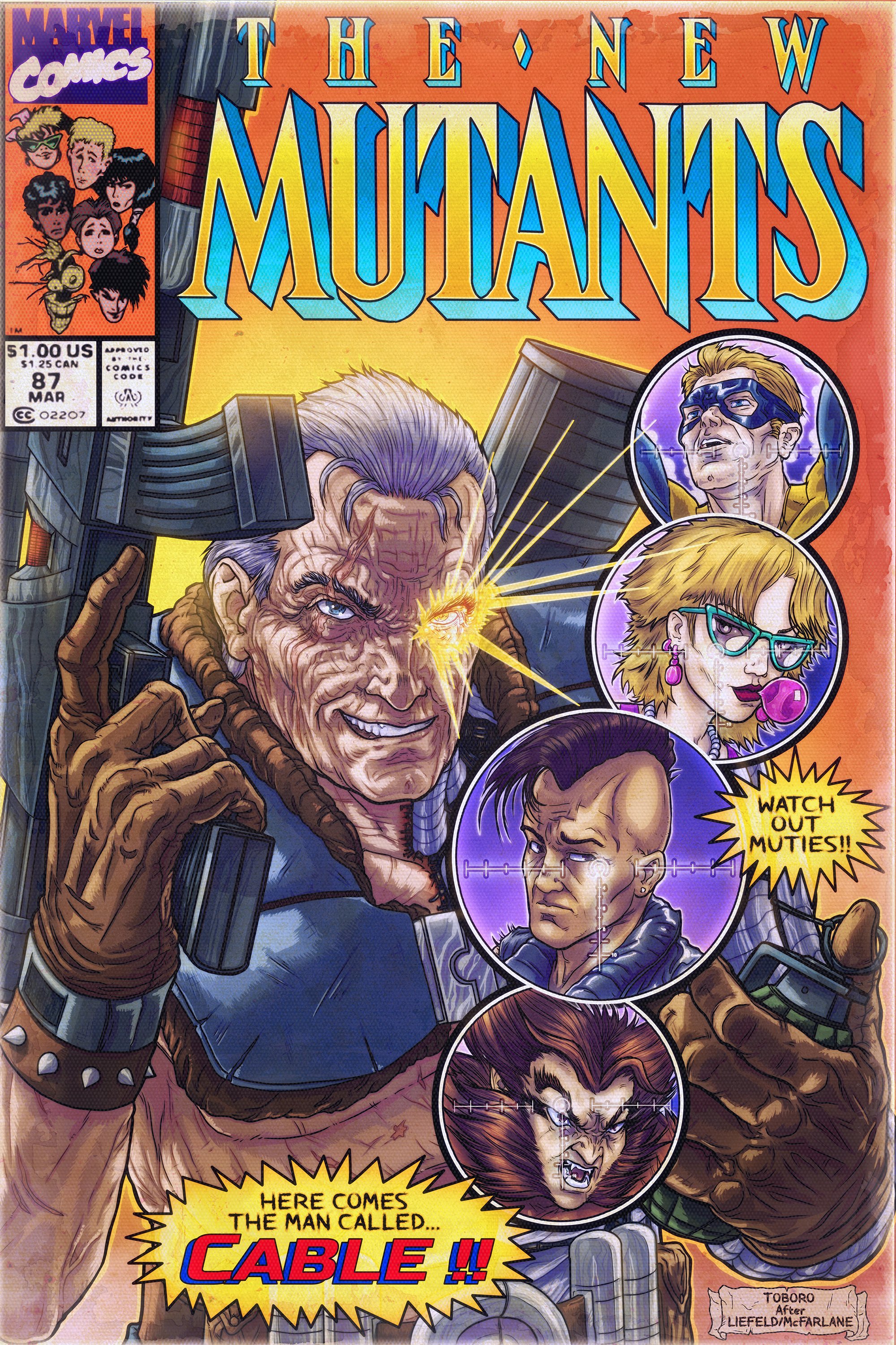
I still remember the buzz around this comic like it was yesterday. Everyone was trying their hardest to develop their own style and rob liefeld was no different. Sure, he had anatomical issues, and tried to hide the things he had a hard time drawing, but so did every kid trying to ape his style. His overemphasis on musculature, the massive guns, shoulder pads, crosshatching, and tilted camera angles, popped right off the page. Besides, who doesn’t like a mysterious cyborg clint eastwood with a glowing eye?
Like a lot of artistic kids in the 80’s, all I wanted to do was draw comics when I grew up. Unfortunately, by the time I was old enough(and competent enough) to do it for a living… I’d come to the conclusion that it wasn’t a career that readily supported all the other things I wanted out of life. Even still, I never gave up my love of sequential art… and to this day, some of my favorite artists either got their start in the medium, or work primarily in comics.
This illustration belongs to a personal project of mine. It’s my love letter to all the books that influenced me, and all the artists I grew up trying to emulate. The basic guidelines I set for myself, were to keep a consistent look and feel between them, to refine the color scheme while still staying true to the originals, and while the style, lighting, and compositions may change slightly… they clearly had to pay homage to what had come before.
Now, the process for these illustrations is fairly complicated. They draw as much from comic art techniques as they do from visual fx compositing. They’re drawn digitally, using my wacom cintiq 24hd and they initially start off as a quick sketch in clip studio paint (as I’ve stated elsewhere, their pencil tool and vector pens are pretty damn phenomenal). Once I’ve laid out the sketch, and I’m happy with the composition, I rough in the lighting and define the forms in black and grey. At this stage, I have a pretty clear idea of what the final image will look like, so I get to work on refining the linework. Each character exists in their own layer group, with separate inner, and outer linework layers. Once I’m finished with the linework, I move on to the shading.. usually involving between 3-7 layers of solid black or white hatching, and fills, all overlapping and with different opacities. I save the file out as a .psb and use these layers as a “lighting pass” for my color work in photoshop. With different merge settings, ranging from overlay, softlight, multiply, or screen, they add value to a “flat” color pass. From there, I dial in the textures, recreate the logo and title elements, and fidget with things until it feels “finished”.
While I plan to add more illustrations in the future, these initial four covers that I’ve posted should give you a pretty solid idea of what I hope to accomplish.